2024 Sans-serif design
Felt like my website got stale again, so it was time to bring it a 2024 design, again inspired from about.me, which does a fantastic job at presenting one self in a simple and clear manner.
Basically, even though I dream about being a writer, I am actually very far from being one. So I felt like the serif font doesn’t suit reality. My reality. And which font is the best sans-seif font? Well, for me is Inter.
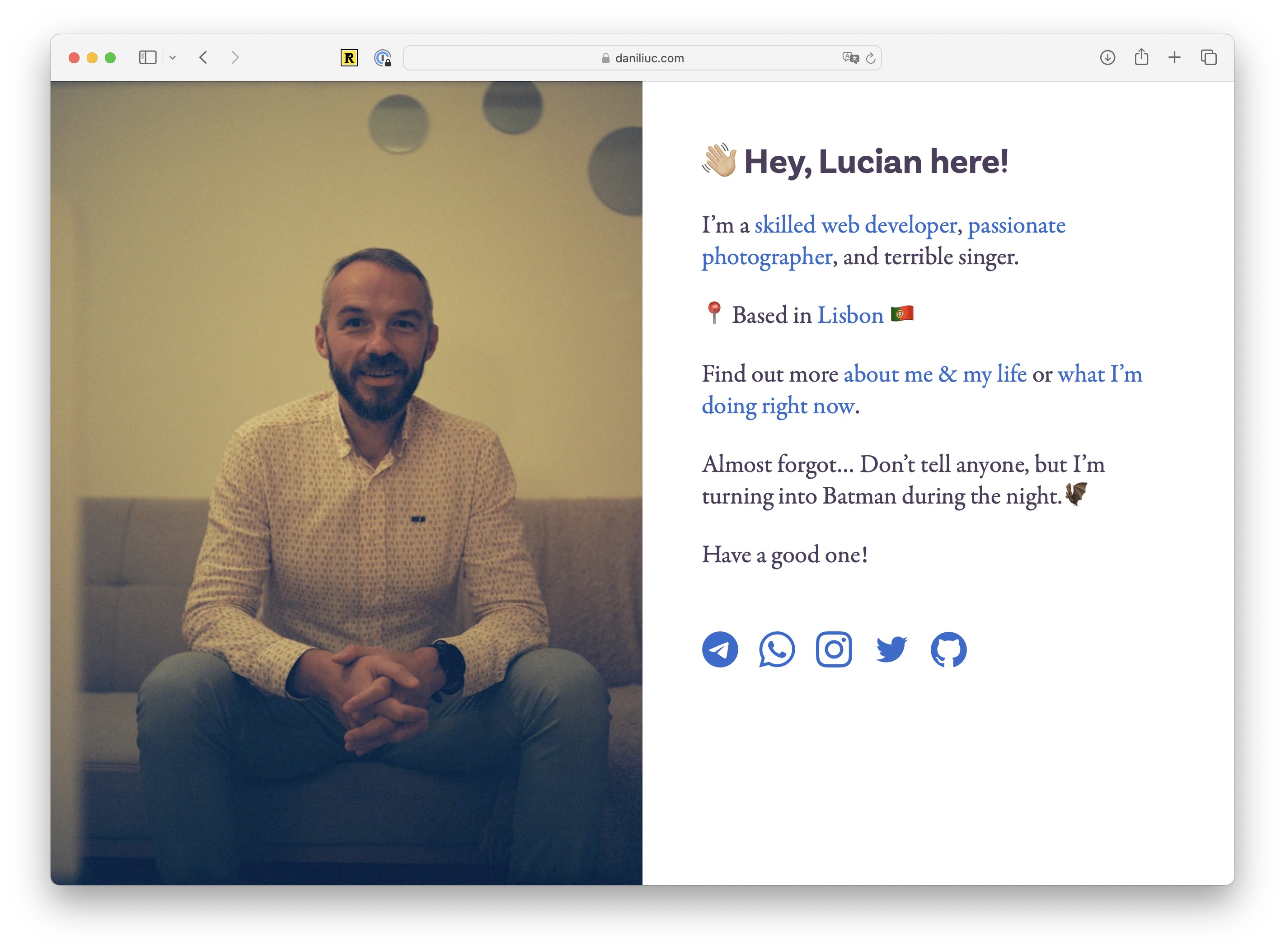
So this how it was up until today…

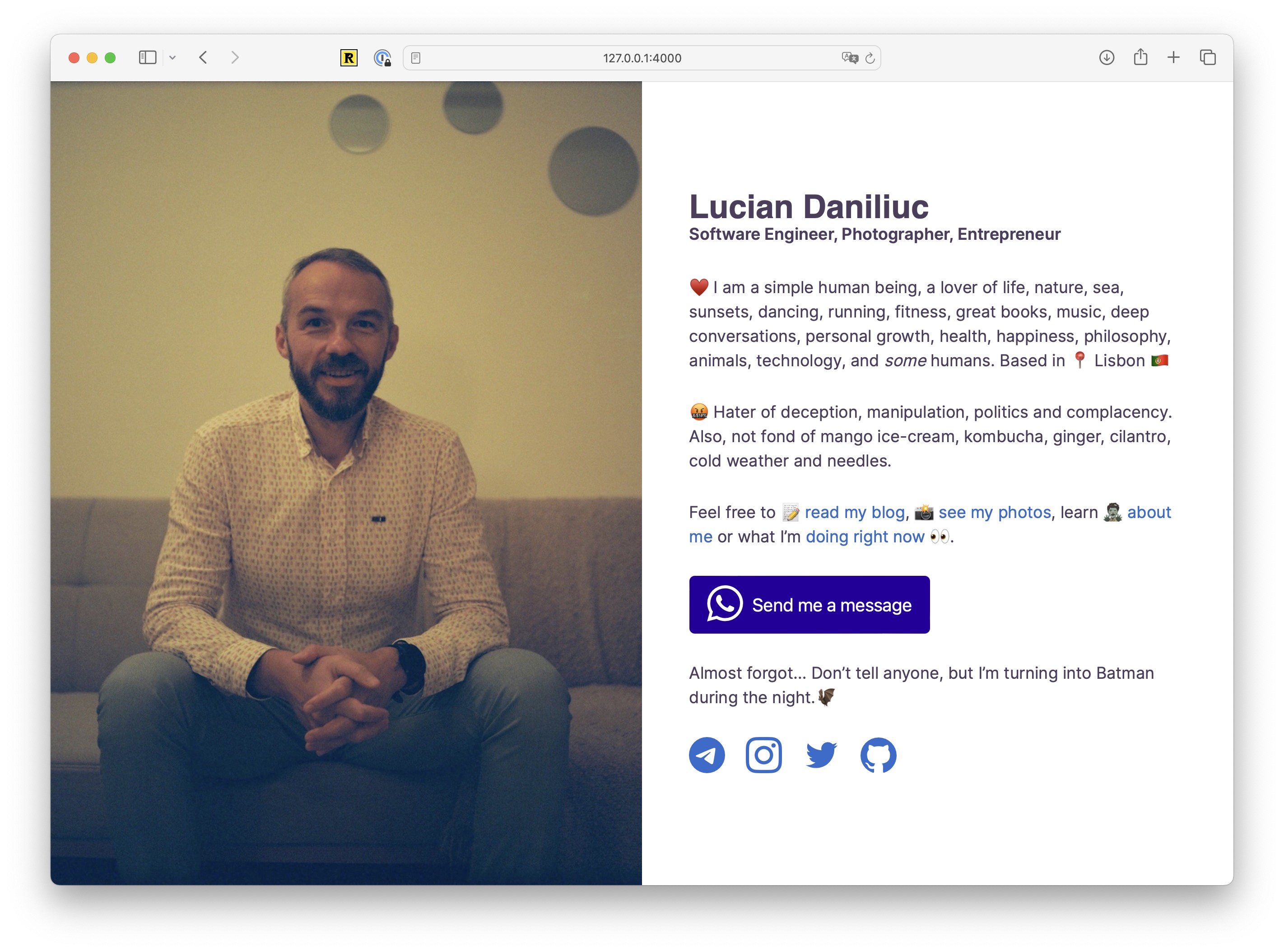
And, with some minor tweaks, this is now it’s going to be moving on…

Basically I’ve added a bit more about me, a very clear CTA to get in touch with me via Whatsapp, changed font sizes, some colors and spacing and that’s pretty much it.
Let’s see how this feels like in the long run. 🏃🏻♂️